
Cowboys Cry Too
Brand Identity
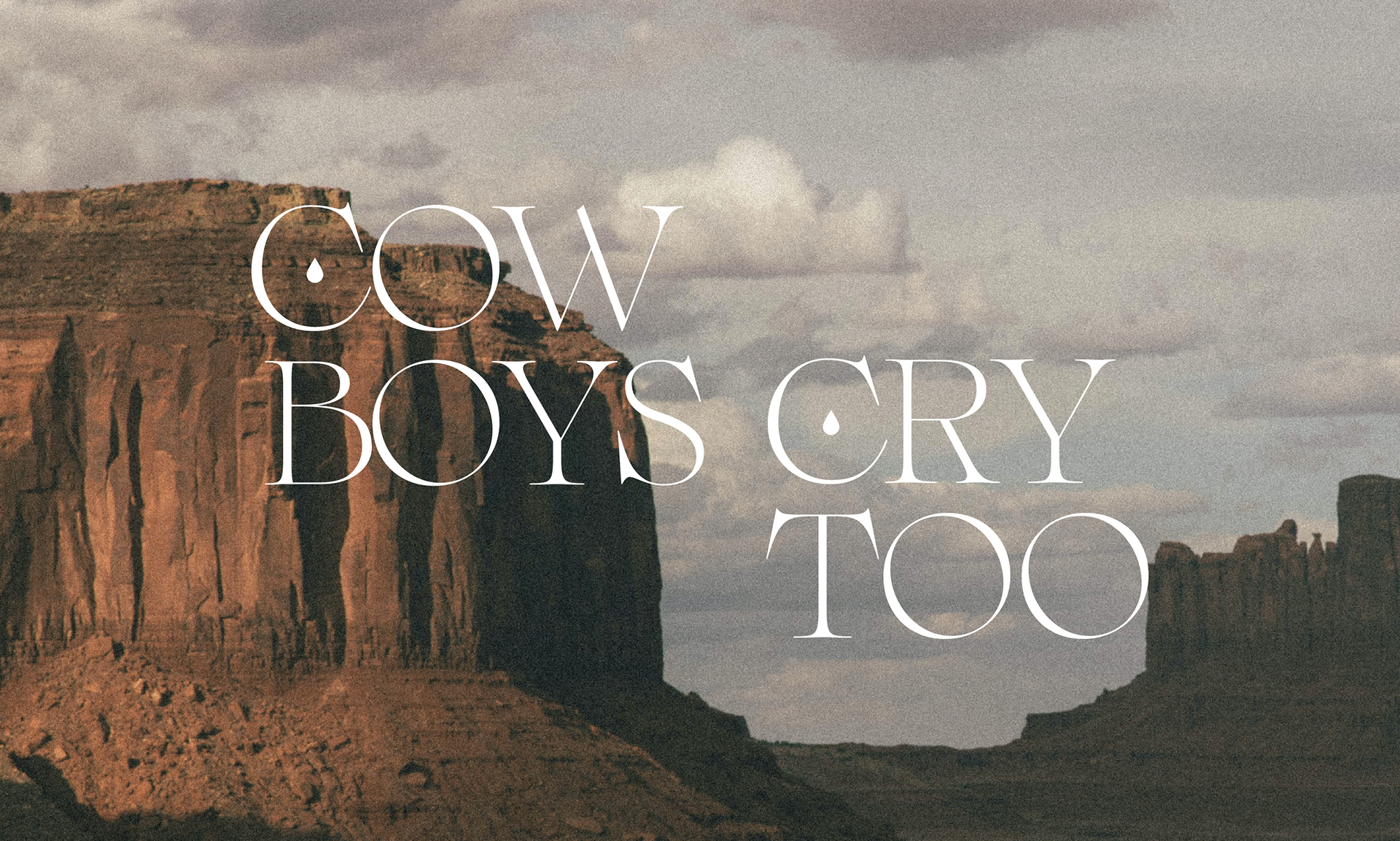
My client approached me about creating branding for her clothing company - Cowboys Cry Too. The name was born from their love of the outback and Western films. The client wanted imagery of the romanticism of lone men and women, the wilderness and the open road they call home. The purpose was to create an engaging brand that speaks to the nomad in all of us - a brand that resonates with all genders and age groups.

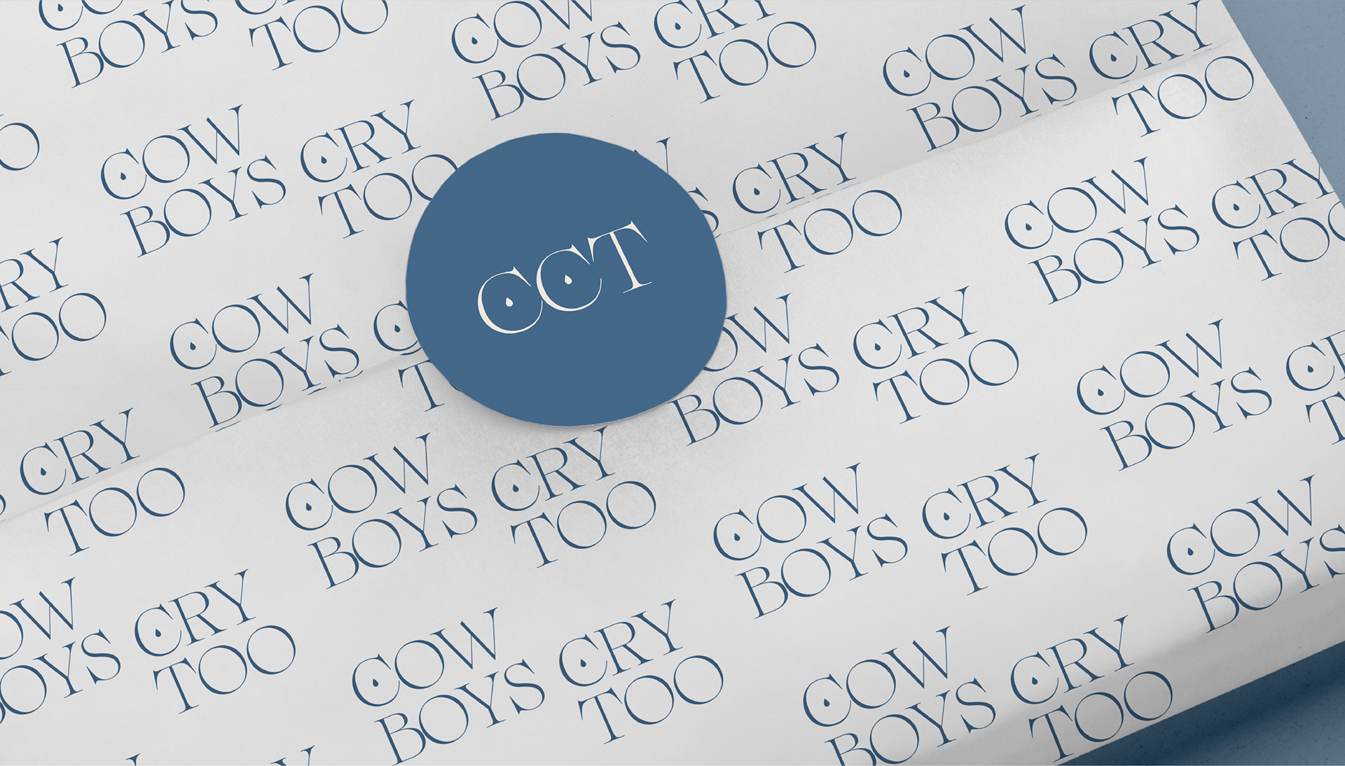
To develop the identity, I began by watching well-known western films and listening to country music. It was very apparent that melancholy is at the heart of most western media. I wanted to design a logo to portray this and clearly emphasise the melancholic mood and persona of the lone cowboy. I used the teardrop as a visual element, connecting the feelings and the sense of solitude that portrays the lonely (and fragile) cowboy. I wanted to encapsulate the fragile heart in the tougher exterior with the placement of the teardrops inside the C’s.
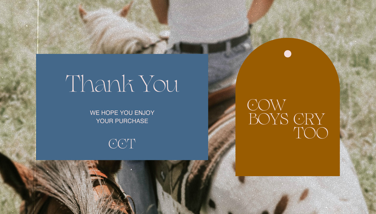
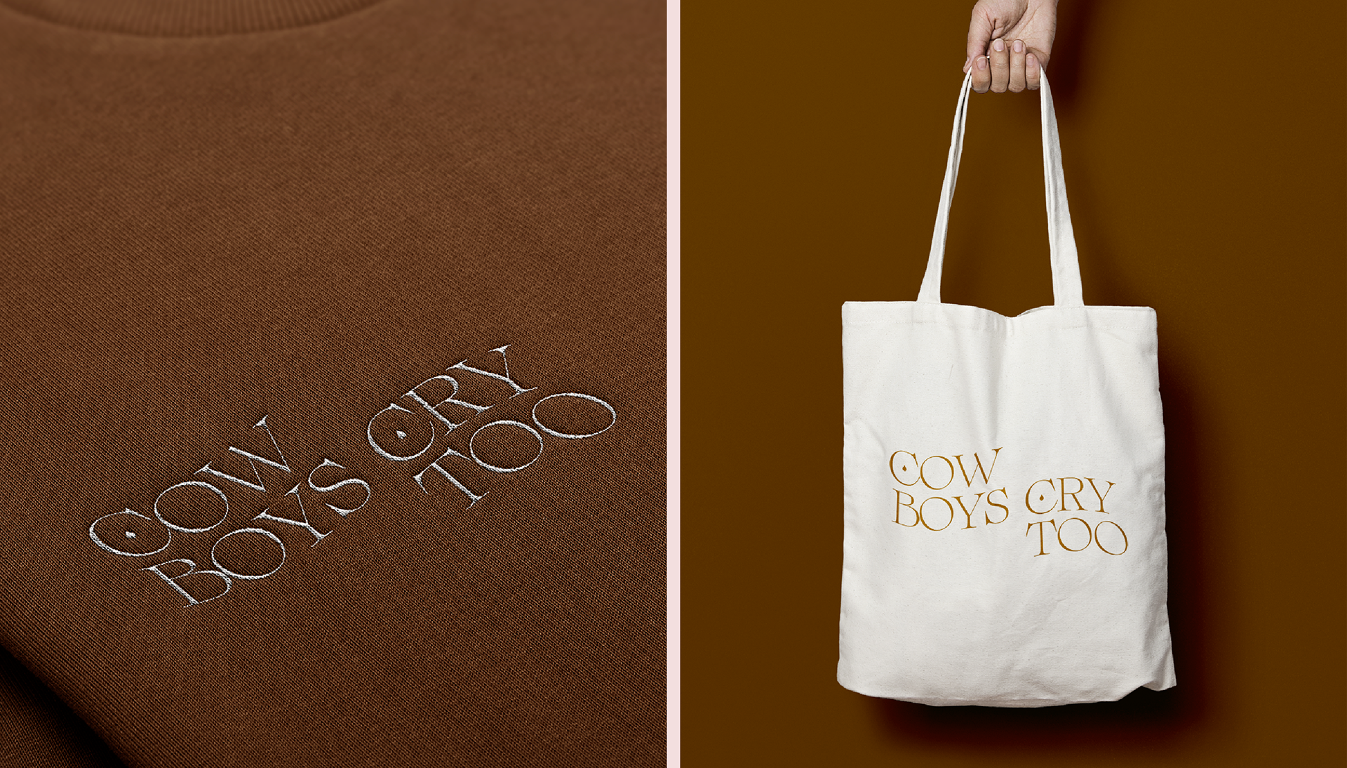
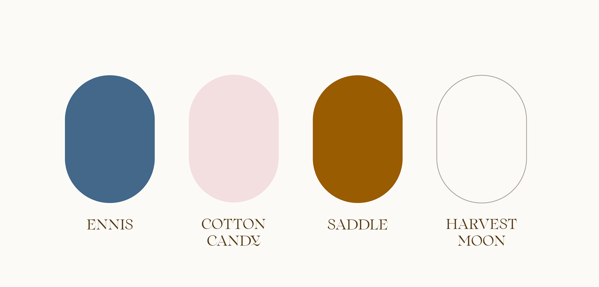
The colour palette is a mix of soft, welcoming, beaming, and natural tones highlighting nature as well as the western aesthetic. Soft denim blue, brown landscapes, and the pink to underline the fragility of those sombre emotions. My intention was for the palette to work with many different styles and forms of mediums.